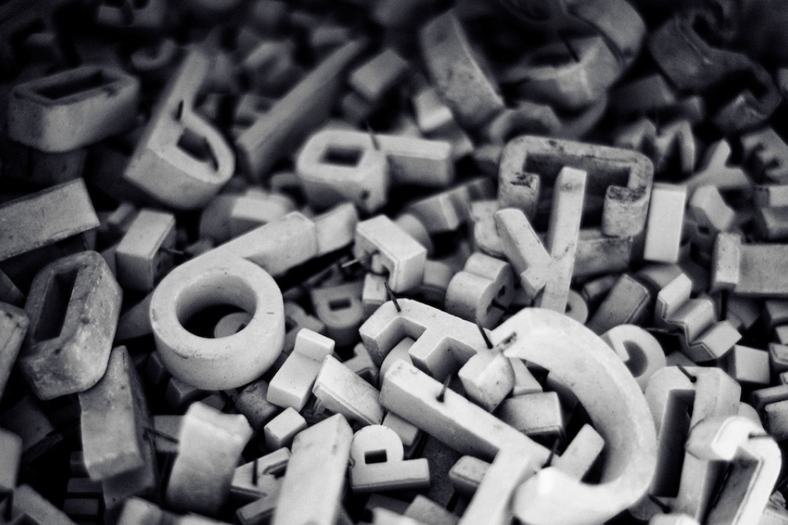
Typography Animations
Motion with Purpose
17 typography animations -- from tasteful entrances to pure combinatorial chaos. Each one outputs copy-paste code.
01 -- Entrances
First Impressions
Entrance
Fade Up with Stagger
Wordsappearonebyone,risinggentlyfrombelow
When to use
Hero headlines, section titles on landing pages. Draws the eye naturally.
When not to
Body paragraphs or UI text. Staggering long content feels slow and annoying.
Entrance
Character Reveal
Each letter fades in
When to use
Short, impactful phrases -- brand names, taglines, pull quotes.
When not to
Anything longer than 30\u00A0characters. Per-letter animation on\u00A0a paragraph is\u00A0torture.
Entrance
Line-by-Line Reveal
First line appears with a clip-path wipe.
Then the second line follows smoothly.
And the third completes the sequence.
When to use
Multi-line quotes, testimonials, step-by-step instructions.
When not to
Dense body copy. The clip-path wipe implies sequence -- don't use it where order does not matter.
Entrance
Typewriter
When to use
Terminal aesthetics, code-themed sites, command-line interfaces.
When not to
Serif or editorial contexts. The monospace cursor breaks the typographic voice.
02 -- Emphasis
Drawing Attention
Emphasis
Subtle Weight Shift
Hover to feel the weight shift
Hover the text above
When to use
Navigation links, interactive labels, variable-font-powered interfaces.
When not to
Static text or fonts without weight axis. Without a variable font, the jump is harsh.
Emphasis
Underline Draw
Hover to draw the underline
Hover the text above
When to use
Navigation links, call-to-action text, inline links in editorial content.
When not to
Every link on the page. If everything draws, nothing stands out.
Emphasis
Highlight Sweep
Hover to sweep the highlight across
Hover the text above
When to use
Key phrases in articles, feature highlights, marketing copy.
When not to
Headings (too heavy) or body text (too distracting for continuous reading).
Emphasis
Letter Spacing Breathe
Hover to breathe
Hover the text above
When to use
Uppercase labels, navigation items, short headings.
When not to
Lowercase body text. Expanding letter spacing on lowercase makes it harder to read.
03 -- Transitions
State Changes
Transition
Blur to Sharp
Clarity arrives gradually
When to use
Hero text, dramatic reveals, content that loads progressively.
When not to
Repeated elements or lists. The blur effect loses impact when overused.
Transition
Color Shift
Color follows your scroll
Scroll to shift the hue
When to use
Data visualization headings, scroll-storytelling, mood-driven pages.
When not to
Accessibility-critical text. Changing color on scroll can confuse screen readers and break contrast ratios.
Transition
Split and Rejoin
Splitapart,thencometogether
When to use
Section transitions, dramatic reveals, short impactful phrases.
When not to
Long sentences. The splitting effect becomes chaotic with too many words.
04 -- Scrolling
Scroll-Driven
Scrolling
Parallax Text Layers
Heading Layer
Body text moves at a different rate, creating depth between layers.
When to use
Landing pages, editorial long-reads, section headers with supporting body text.
When not to
Mobile-first designs. Parallax effects can feel janky on touch devices.
Scrolling
Progressive Reveal
Thistextrevealsitselfasyouscrolldownthepage,eachwordbecomingvisibleinsequence.
Scroll to reveal
When to use
Storytelling, long-form narratives, manifesto-style content.
When not to
Content users need to\u00A0scan quickly. Forced sequential reading frustrates\u00A0skimmers.
Scrolling
Scale on Scroll
Scale follows scroll
Scroll to scale
When to use
Hero headings, dramatic single-word titles, section transitions.
When not to
Body text or anything meant to be read. Scaling distorts readability.
05 -- Experimental
Math Experiment Gone Wrong
Target Style (resolved form)
Chaos Controls
Click individual letters in the demos to lock/unlock them to the resolved style
Color Palette (12 colors)
Click swatch to change color. Hover to remove. Up to 24 colors.
Experimental
Typographic Chaos
When to use
404 pages, creative agency portfolios, experimental art sites. Maximum visual disruption.
When not to
Anywhere users need to actually read. This is spectacle, not communication.
Experimental
Combinatorial Storm
When to use
Generative art, music visualizers, loading screens where chaos IS the content. Not meant to be read.
When not to
Anywhere legibility matters. This is a math experiment gone horribly wrong -- by design.
Experimental
Entropy Collapse
0s / 30s -- Pure chaos
When to use
Hero intros, experimental portfolios, the 30-second journey from pure chaos to perfect Playfair -- with actual chaos in the process.
When not to
Impatient users. This is a 30-second meditation on typography finding itself.
Font Mix (6 selected — min 2)
Experimental
Font Clash
When to use
Showcasing font diversity, type specimen pages, creative portfolios. Pure typography — no gimmicks.
When not to
When you need consistency. The beauty here is in the contrast between typefaces.